Digitization help student to explore and study their academic courses online, as this gives them flexibility and scheduling their learning at their convenience. Kidsfront has prepared unique course material of Data Interpretation Data Interpretation for Quantitative Aptitude Practice student. This free online Data Interpretation study material for Quantitative Aptitude Practice will help students in learning and doing practice on Data Interpretation topic of Quantitative Aptitude Practice Data Interpretation. The study material on Data Interpretation, help Quantitative Aptitude Practice Data Interpretation students to learn every aspect of Data Interpretation and prepare themselves for exams by doing online test exercise for Data Interpretation, as their study progresses in class. Kidsfront provide unique pattern of learning Data Interpretation with free online comprehensive study material and loads of Quantitative Aptitude Practice Data Interpretation Data Interpretation exercise prepared by the highly professionals team. Students can understand Data Interpretation concept easily and consolidate their learning by doing practice test on Data Interpretation regularly till they excel in Data Interpretation Data Interpretation.
 The bar graph given below shows the data of the production of Wheat (in lakh tonnes) by three different Countries X, Y and Z over the years.
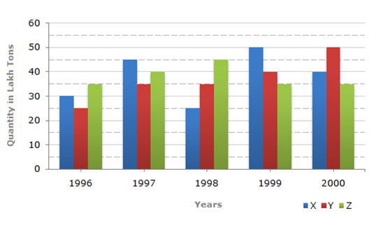
 Correct Answer Is : 1997 The bar graph given below shows the data of the production of Wheat (in lakh tonnes) by three different Countries X, Y and Z over the years. Correct Answer Is : 23:25 The bar graph given below shows the data of the production of Wheat (in lakh tonnes) by three different Countries X, Y and Z over the years. Correct Answer Is : X and Z both The bar graph given below shows the data of the production of Wheat (in lakh tonnes) by three different Countries X, Y and Z over the years. Correct Answer Is : 1996 The bar graph given below shows the data of the production of Wheat (in lakh tonnes) by three different Countries X, Y and Z over the years. Correct Answer Is : 0.6 A pharma company provides five different products. The sales of these five products (in lakh number of packs) during 1995 and 2000 are shown in the following bar graph.
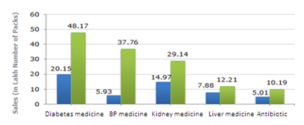 Correct Answer Is : 0.28 A pharma company provides five different products. The sales of these five products (in lakh number of packs) during 1995 and 2000 are shown in the following bar graph. Correct Answer Is : Liver medicine A pharma company provides five different products. The sales of these five products (in lakh number of packs) during 1995 and 2000 are shown in the following bar graph. Correct Answer Is : 5:02 A pharma company provides five different products. The sales of these five products (in lakh number of packs) during 1995 and 2000 are shown in the following bar graph. Correct Answer Is : Liver medicine A pharma company provides five different products. The sales of these five products (in lakh number of packs) during 1995 and 2000 are shown in the following bar graph. Correct Answer Is : 36%